Summary
- Windows Vista’s transparent Aero theme was a significant departure from the look of Windows XP.
- Windows 11 brings transparency back to Microsoft’s desktop in a big way, enshrining Vista’s legacy.
- Apple iOS, Samsung’s One UI 7, and other mobile interfaces keep transparent visuals alive on portable devices.
I was happy to upgrade from Windows XP to Vista for one simple reason: I never liked how XP looked, but I loved how Vista did. Decades later, companies are continuing to embrace this one aspect of Vista that Microsoft nailed.
Windows Vista Introduced a Transparent Aero Theme
There were many changes introduced in the upgrade from Windows XP to Vista, like stronger security practices and improved indexing for search. Both of these contributed to what people hated about Vista—its annoying security pop-ups and slower performance paired with higher system requirements.
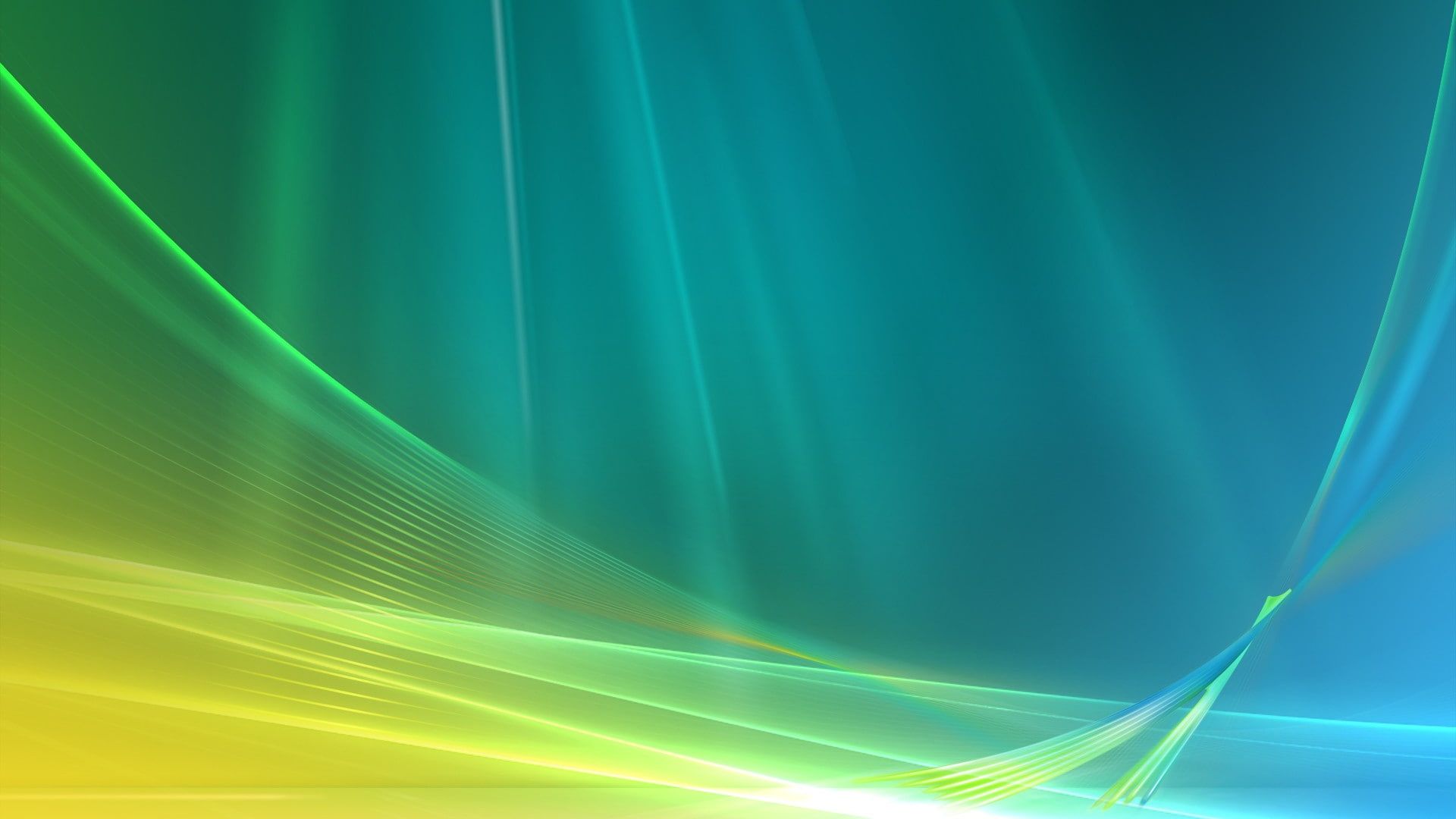
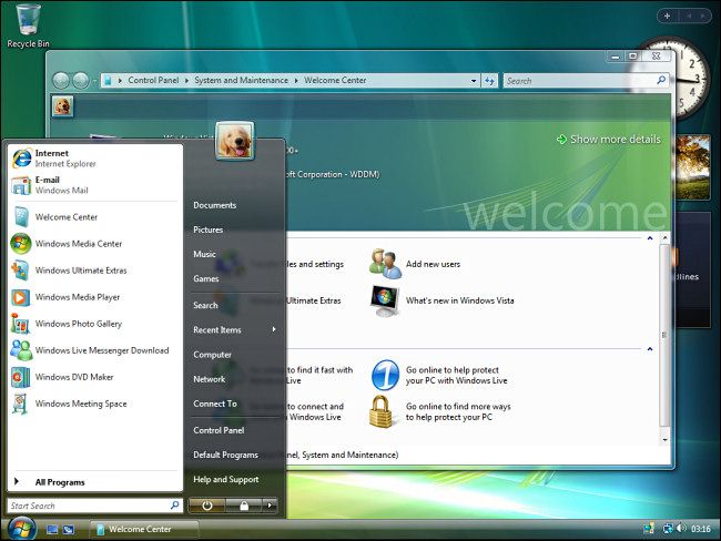
The feature I cared most about, though, was the transition from XP’s stale blue interface to the more modern Aero theme. This new look allowed us to pick our own colors, but more importantly, it was transparent. You could peer through the title bar and window borders to see what was in the background, with just the right amount of blur.
Microsoft leaned harder into this look with Windows 7, which had a taskbar that was more like a transparent dock. This ended up being my favorite version of Windows, even though it was the one I used the least. I already had my feet firmly planted in Linux soil by this point, but Windows 7 was just pretty enough that I wanted to give Windows one last chance.
Windows 11 Bought Transparency Back
Windows 8 tossed out the looks that made Windows 7 great in favor of a flat Metro design pioneered on the Zune mp3 player and Xbox 360. In Microsoft’s efforts to combine the desktop with tablets, it envisioned a work environment that consisted of square tiles with no transparency, blur, or gradients. Though we were continuing to work via screens made of glass, the interface would no longer look like glass.
Like Vista, Windows 8 was a bit of a flop, but the flatness continued into the far more popular Windows 10. It wouldn’t be until Windows 11, the current version of Windows, that Microsoft would return to a transparent desktop.
I haven’t returned to Windows, but when I do set my eyes on a Windows computer, this one aspect (and this aspect alone) feels just right.
iOS Has Been Transparent Since the iPhone 5s
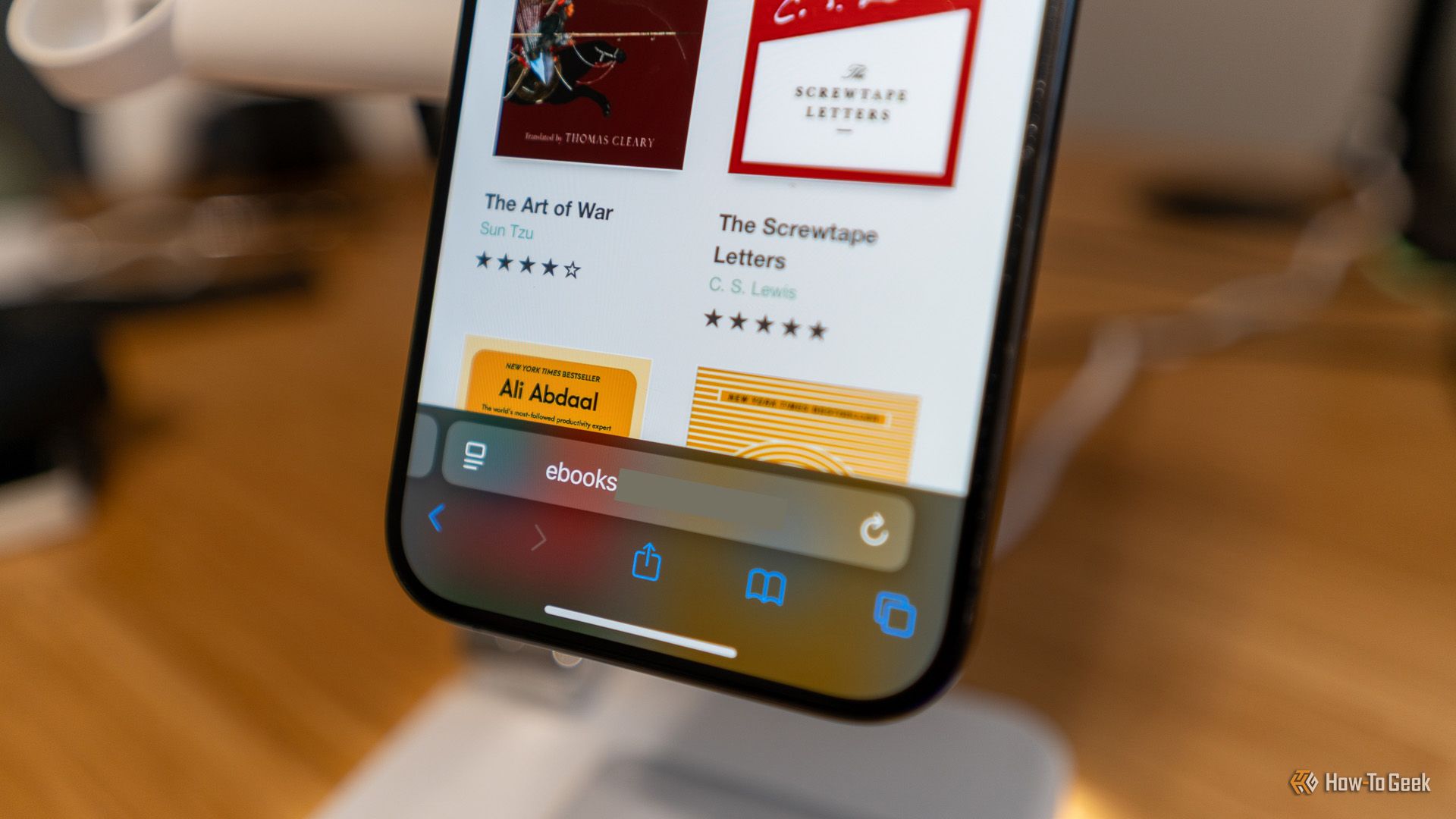
Microsoft has been validated less by its own success, but the success and decisions of others. Vista came out in a time before the iPhone, which would eventually launch with a skeuomorphic design. Then, with iOS 7, Apple leaned hard into transparency, blurring, and gradients. It’s a look that has stuck with iPhones to this day.
Rumors hint that iOS 19 will usher in a major visual overhaul. Yet this isn’t Apple pulling a Windows 8, opting to make the iPhone interface as flat as the apps are. Or rather, Apple is pulling a Windows 8 in a different way by bringing in a design already pioneered on another (similarly unpopular) device. Future iPhones are expected to resemble visionOS from the Apple Vision Pro.
Just as the Zune’s biggest legacy is the design it ushered in, there’s a future where the Vision Pro may be best remembered as the device that made all Apple products even more glassy.
Samsung One UI 7 Is All About Transparency
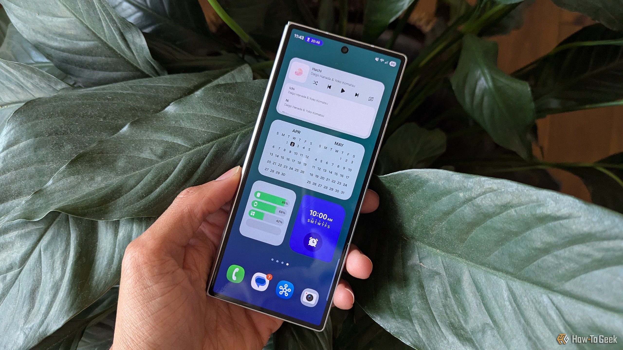
I don’t use a Windows PC, nor do I own any Apple products. I’m instead writing these words on a Samsung Galaxy Z Fold 6, which I use more as a PC than as a phone. When Samsung showed off One UI 7, the newest version of its Android interface, I was more stoked for an update than I’ve been in years.
Part of my excitement had to do with how hard Samsung was leaning into making everything transparent. This is not a sentence any tech company wants to hear, but it was Vista all over again!
Unlike Vista, there’s very little I don’t like about One UI 7. One of my favorite things about Android from the beginning has been the ability to swap out the default look for a custom launcher, yet this is one of the few times I haven’t wanted to.

Related
Samsung’s One UI 7 Has Changed How I Feel About Default Android Launchers
I refused to touch TouchWiz, but I believe in redemption.
This trend isn’t limited to Samsung. Various Chinese brands that aren’t allowed in the US, like Xiaomi and Huawei, also have transparent designs. With Android 16, early looks suggest transparency and blur are expected to be baked into the look of stock Android. This is a look we’re going to see for years to come.
Windows Vista is far from beloved, and while I do remember it more fondly than most, even I wouldn’t argue it was one of the greats. Yet its legacy lives on. The future is set to look even more like Windows Vista than it did in 2007.

Related
Was Windows Vista Really That Bad—or Just Misunderstood?
Revisiting what’s probably Microsoft’s biggest disaster in the 2000s.


