Quick Links
What do you think of when you see the words “Microsoft Excel?” For many, it’s “cells,” “numbers,” and “formulas.” However, there’s much more to the program than that! You can also create stunning 3D visuals of geographical data in just a few steps.
The 3D Map tool is an upgraded version of Power Map, introduced to Microsoft Excel in 2013. In 2016, Power Map became 3D Map, and in 2024, it moved to a different location on the ribbon. The steps and screenshots in this guide apply to Excel for Microsoft 365 and are correct as of June 2025.
|
Excel Version |
Tool Name |
Where to Find the Tool |
|---|---|---|
|
Microsoft Excel 2013 |
Power Map |
Tours group of the Insert tab |
|
Microsoft Excel 2016 |
3D Map |
Tours group of the Insert Tab |
|
Microsoft Excel 2024 and Excel for Microsoft 365 |
3D Map |
Data Model drop-down menu in the Data Tools group of the Data tab |
Prepare Your Data
The key to ensuring the 3D map works as expected is preparing your location data correctly. Specifically, you need to ensure you have at least one of the following categories or combinations of categories in your dataset:
- Latitudes (or y-coordinates) and longitudes (or x-coordinates)
- Country and region
- State and province
- County
- City
- Zip or postal code
- Street
The more specific your data, the more accurate your 3D map will be. Also, using narrowed-down data, such as streets and zip codes, will help you avoid geocoding errors that occur when there is conflicting data, like multiple cities in different states with the same name.
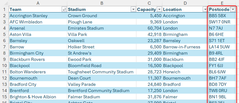
In this example, I’ve created an Excel table of soccer teams in the UK. The geographical dataset I will primarily use for the 3D map will be the stadium postcodes, as these are the most specific geographical data I have for each record.
To follow along as you read this guide, download a free copy of the Excel workbook used in the examples. After you click the link, you’ll find the download button in the top-right corner of your screen. Alternatively, download a sample dataset created by Microsoft.
Although you don’t have to format your data as an Excel table, doing so will make life easier if you add more rows or columns, and Excel generally reads data formatted as a table better than data placed in unformatted cells.
Related
Everything You Need to Know About Excel Tables (And Why You Should Always Use Them)
This could totally change how you work in Excel.
Launch a 3D Map
Once you’ve prepared your data, you’re ready to start creating your 3D map.
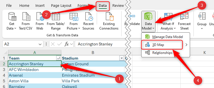
Select any cell within the data, and in the Data tab on the ribbon, click Data Model > 3D Map.
Microsoft Excel uses Bing Maps to generate the 3D map. As a result, you must have an internet connection for this tool to work.
If you haven’t used the 3D Map tool before, you’ll see a prompt telling you that you need to enable the Data Analysis add-ins to continue. If you’re happy with this, click “Enable.”
This opens a new window where the 3D map-making magic happens!
Modify the 3D Map
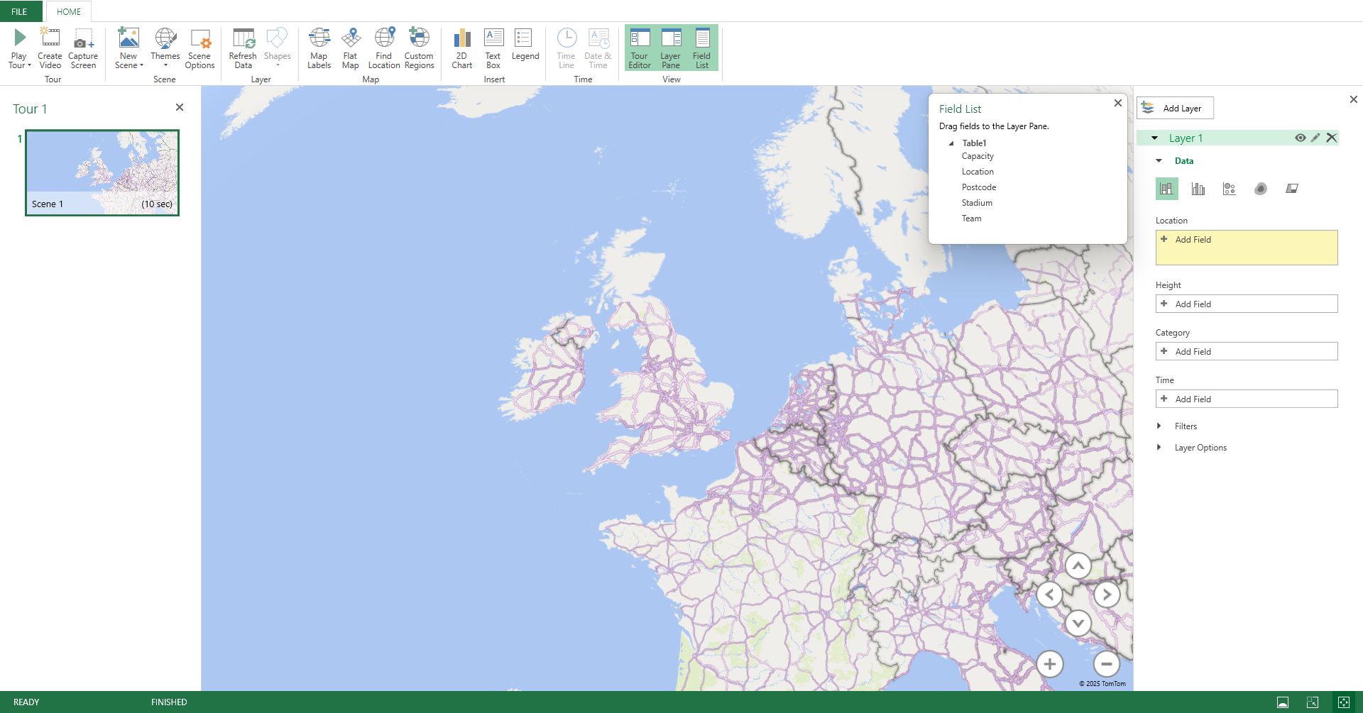
Before I show you how to manipulate your map, let’s take a moment to understand what each part of the 3D Map window contains and does.
- Tour Editor (left-hand pane): If your original data contains time-related information, this is where you can create different scenes that show changes over time in different areas.
- Layer Pane (right-hand pane): This is where you choose what to plot on the 3D map.
- Field List (floating pane): You can click, drag, and drop fields from the Field List into the relevant area of the Layer Pane.
- Map Area (center): This is the main section of the 3D map window. As you build your map, the 3D globe updates to reflect the changes you make.
You can show and hide the Tour Editor, Layer Pane, and Field List by clicking the relevant icons in the Home tab on the 3D Map window ribbon.
The first element to focus on is the Layer Pane. When you first generate the 3D map, Excel will review your column headers and try to identify which column contains the geographical data you want to plot. If it has been successful in doing this, the Location field in the Layer Pane will already be populated, and your 3D map will already contain some data points.
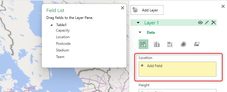
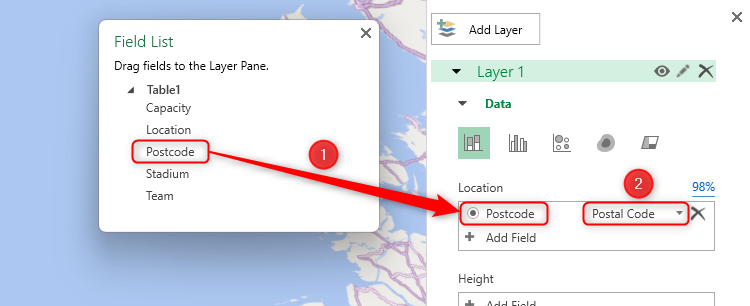
However, in my case, the Location field is empty and highlighted yellow, which means that Excel hasn’t recognized the column header “Postcode” in my original data. As a result, I’ll need to link that column to the map manually.
If you find yourself in the same situation, click the most specific geographical measurement in the Field List, and drag it to the Location field in the Layer Pane, and ensure the radio button is selected. Then, choose the corresponding category in the drop-down list to the right.
Click the pen icon next to the layer title to change its name. This is a beneficial step to take if you intend to add more than one dataset to your 3D map.
Take a moment to review the mapping confidence percentage above the Location field in the Layer Pane. If this is not 100%, click the figure, review the errors, and make the necessary changes to the source data in the spreadsheet window.
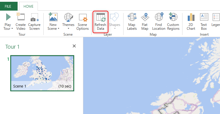
Then, click “Refresh Data” in the Home tab of the 3D Map window, and repeat this process until the mapping confidence is 100%.
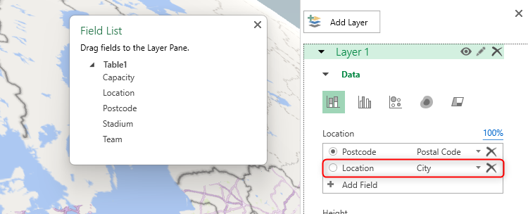
If you anticipate that you’ll benefit from seeing the map at a less granular level, you can also click and drag a broader category to the Location field in the Layer Pane. For example, as well as displaying the locations of individual stadiums, I also want to see how they cluster together in different areas. I can then activate the relevant radio button later on to see different levels of data.
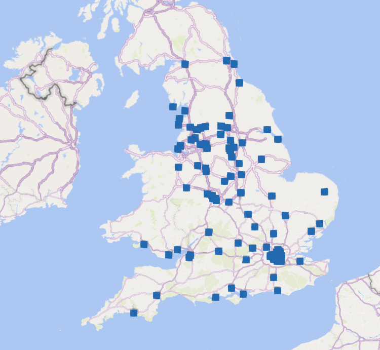
So far, you’ve added the stadium postcodes to the 3D map, but at the moment, it’s not particularly easy to interpret.
So, let’s make some more changes to the Layer Pane details to improve the data visualization.
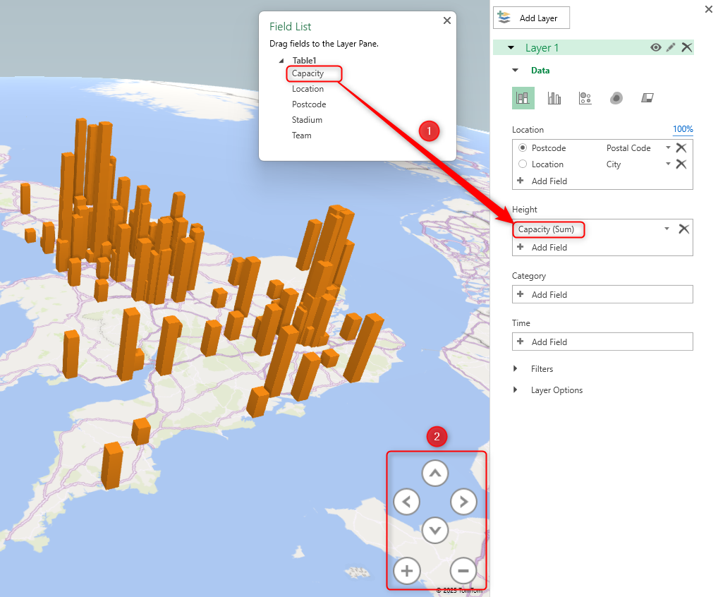
One major benefit of the 3D Map tool is that you can make data points grow to different heights according to a specific variable, like stadium capacities. To do this, click and drag the variable from the Field List to the Height field in the Layer Pane. Then, adjust the viewing angle of the 3D map using the arrows in the bottom right corner of the Map Area, so that you can compare the values more easily.
Even though the 3D map is making good progress, the columns are still not very distinguishable, and when you hover over one of the data points, what you see on the data card still doesn’t add much value.
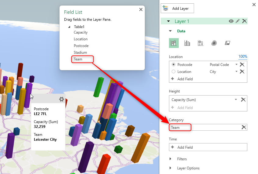
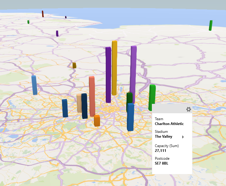
So, let’s add some more fields to the Layer Pane. Specifically, clicking and dragging “Team” from the Field List to the Category field in the Layer Pane assigns a different color to each data point and adds more valuable context to the data cards.
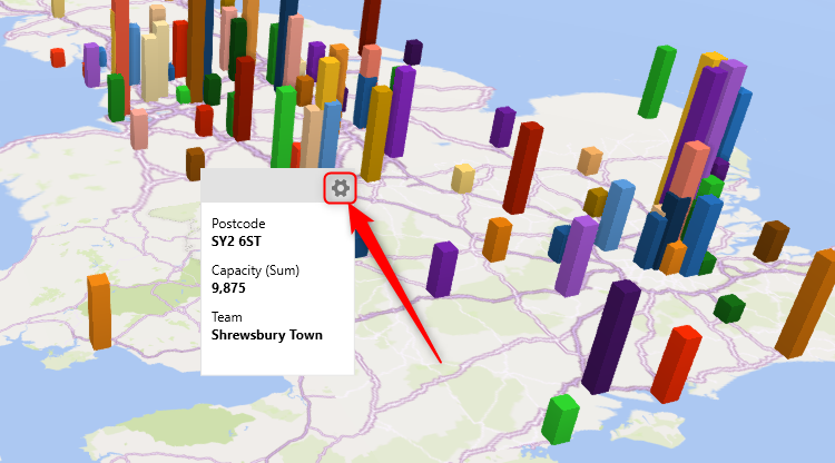
To make further changes to the data cards, hover over a data point on the 3D map, and click the “Settings” cog in the corner of the corresponding label.
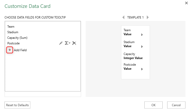
In this case, I added the stadium name by clicking the “+” next to Add Field, and I clicked and dragged the labels to present them in a more logical order. The preview on the right shows how it’ll look once I click “OK.”
Now, the map is easy to read, the data cards provide all the necessary information, and you can use the navigational arrows or the scroller wheel on your mouse to explore the different regions in more depth.
Right-click a data point, and select “Add Annotation” to add more information that a data card can’t display. For example, you could add a picture of a stadium, or a description of the data point.
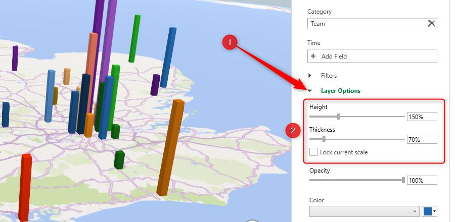
What’s more, when you click “Layer Options” in the Layer Pane, you can modify how they appear on the 3D map. For example, you can increase the height proportions of the data points to compare them more easily, or reduce the column widths to make them even more distinguishable from each other.
You can also filter your data by one of the variables in your source data by expanding the “Filters” section of the Layer Pane and clicking “Add Filter.” In this example, I’ve filtered the map to display only the stadiums located in the London region.
Click “Find Location” in the Home tab on the ribbon to narrow your 3D map to a certain location. For example, you could type a country, a region, or a city. What makes this a particularly useful tool is that the location you type doesn’t have to be in the original dataset—you can enter any location that Bing Maps recognizes.
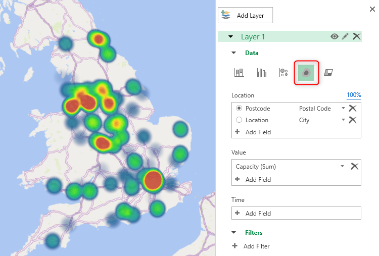
Finally, rather than visualizing your data as columns, you can display a bubble map or, as shown in the example below, a heat map, which provides a more regional overview than a granular picture. To do this, head to the top of the Layer Pane, and choose a visualization type.
Once you’ve spent some time exploring the various visualization options and tools above, try out these three additional tools to further tailor the appearance of the 3D map to your needs.
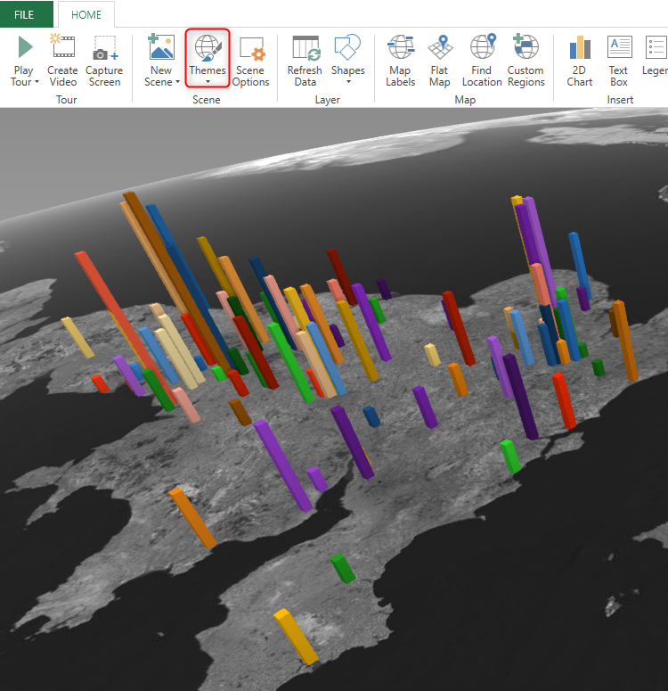
First, adjust the 3D map’s overall appearance by clicking the “Themes” drop-down menu in the Scene group of the Home tab. Here, selecting the Aerial Dark theme makes the data points stand out.
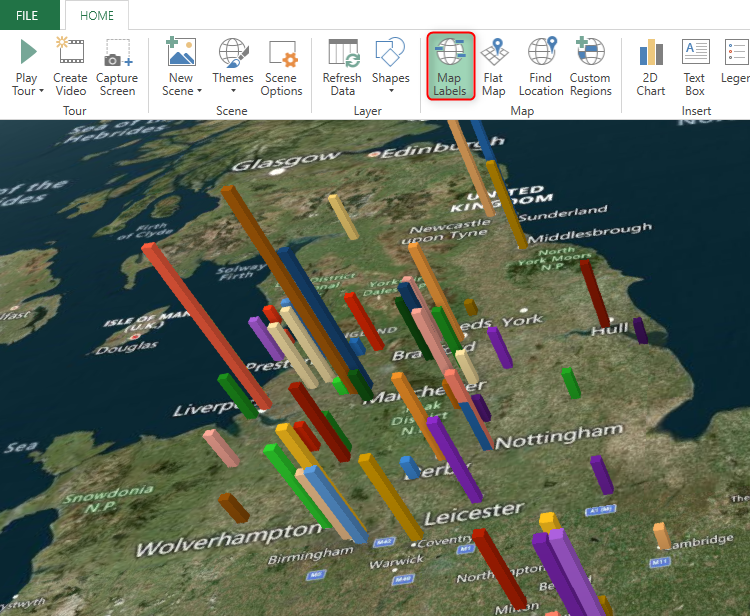
Second, to make the map easier to read by adding place names, click “Map Labels.”
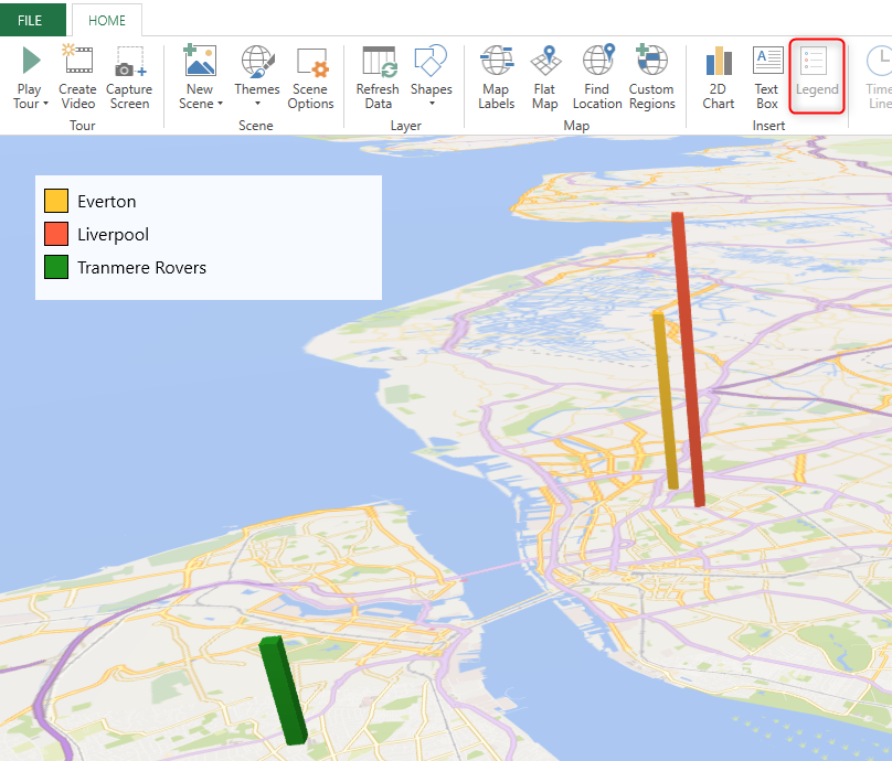
Finally, click “Legend” to match the data points with the field selected in the Category section of the Layer Pane. This is particularly handy if your 3D map only has a few data points, or if you’ve filtered the data.
Press Delete with the legend selected to remove it.
Export the 3D Map
Once you’re set on a particular view of your 3D map, there are two ways to capture the result.
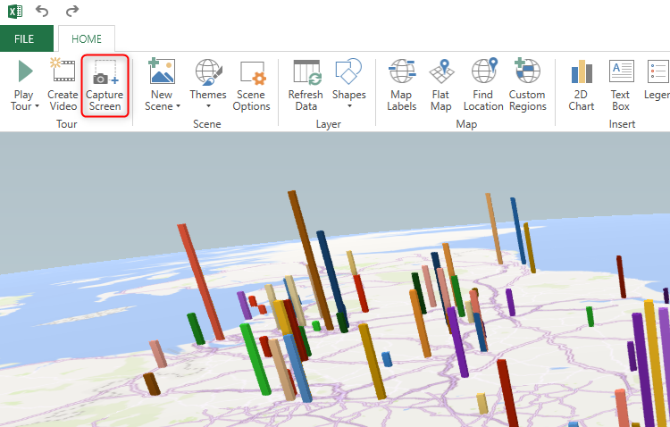
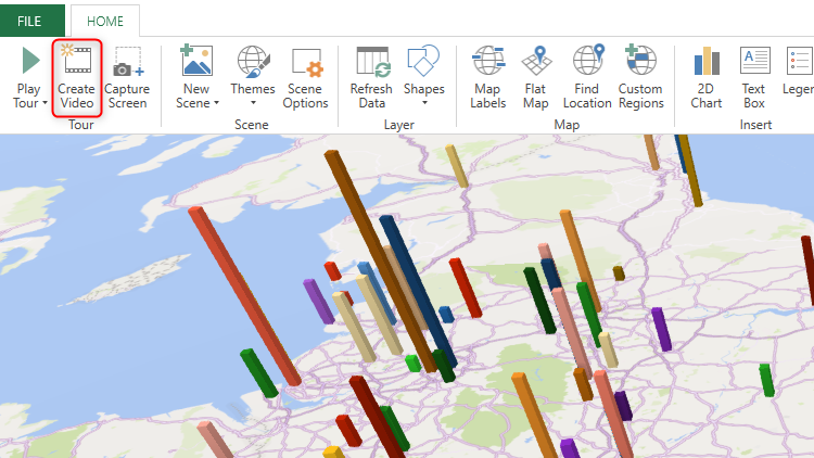
First, to capture an image of the current view, click “Capture Screen” in the Home tab.
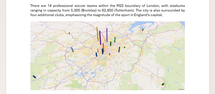
This captures the Map Area and legend (if activated), but not the Tour Editor, Layer Pane, or Field List, and adds it to your clipboard. You can then paste it into another program, such as Microsoft Word, to add stunning visuals to your work. You could also paste it next to the source data to spruce up your Excel worksheet.

Related
Clipboard History Is the Best Windows Feature You’re Probably Not Using
Most of us could use a virtual clipboard.
On the other hand, if you use the Tour Editor to create animated time-related scenes, click “Create Video” to save an MP4 in a folder of your choice. You can then embed the video in a PowerPoint slide or on a web page, or send it to your coworkers as an email attachment.
Click “X” in the top-right corner of the 3D Map window to close it. Then, to continue from where you left off, click Data > Data Model > 3D Map. As always, be sure to save your workbook or activate AutoSave to avoid losing your hard work!
If you prefer to present your geographical data in Excel in a more straightforward manner, create a geographical map chart. You can then format it with labels, a legend, and a suitable color scheme, and move and resize the map so that it fits neatly within your worksheet or Excel dashboard.

