Even if you’re an expert web designer, there are plenty of obscure CSS properties you’re unlikely ever to use. In fact, with hundreds of supported properties, there are parts of CSS you’ll probably never even learn about. Some worth knowing despite being uncommon.
Thanks to Google’s Platform Status report you can find out which properties are used the least, and maybe learn about a new, powerful property while you’re at it. I’ve put pulled out some of the most interesting. Some of these CSS properties are experimental, browser-specific, or otherwise not widely implemented. But all the properties featured here are well-supported by current browsers; they’re just rarely used.
1
empty-cells
This property is specific to tables, and you can use it in conjunction with border-collapse: separate. It controls whether cells with no visible content show their background and borders.
Here’s an example table, with one empty cell and another that spans the cell below it:
        <table>
    <tr>
        <td>Applestd>
        <td>4td>
    tr>
    <tr>
        <td>Grapestd>
        <td>td>
    tr>
    <tr>
        <td rowspan="2">Bananastd>
        <td>4td>
    tr>
    <tr>
        <td>9td>
    tr>
table>
Because the empty cell has no content at all, it can be controlled with the empty-cells property:
        td {
    empty-cells: hide;
}
Now, any table cells without visible content will stop displaying any background color or border:
This effect can be particularly useful with larger tables, helping to clearly identify missing or unusual data. Note that a table with collapsing borders will continue to show both borders and background, even if empty cells are hidden using this property.
2
text-underline-position
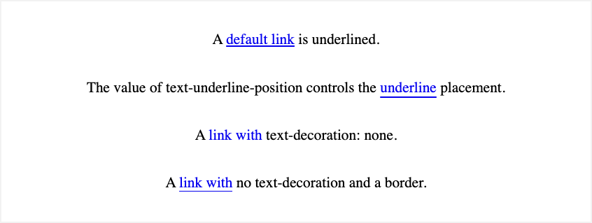
More than four in five websites use the text-decoration property, often to control how links are underlined. But the underline value for this property can be accompanied by a less-often-used property, text-underline-position:
        a {
    text-decoration: underline;
    text-underline-position: under;
}
With an “under” value, the underline will push down so that it doesn’t intersect with the descenders in letters like j and g. This can improve readability, especially with shorter line-height settings.
Before this property, a common workaround was to emulate the underline with a bottom border. That approach has unwanted side-effects, however, and can be awkward to manage, so it’s fortunate that you no longer need to resort to it.
3
column-span
Columns are a fairly little-used CSS property, featuring on just under 3% of all web pages. Long mimicked using workarounds like display: float, columns have also suffered from cross-browser inconsistencies and a lack of clear understanding; they’re not for general-purpose layout, people!
However, when used to recreate traditional newspaper-style columns, this property can add interest to text-heavy designs and improve readability. They’re particularly useful when you want to use the full width of larger screens, such as those used for desktop displays.
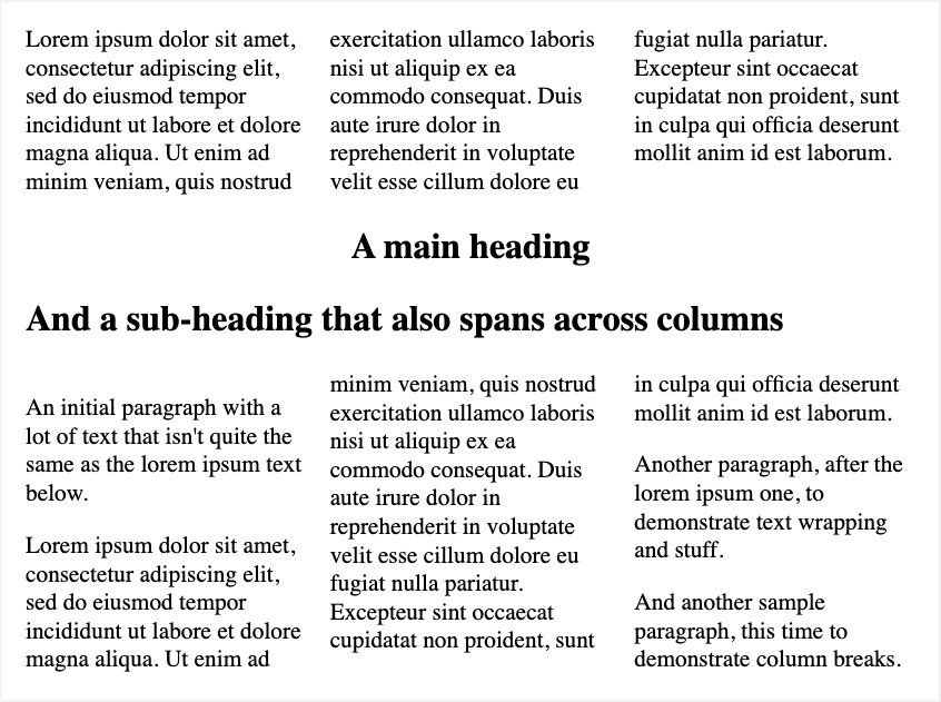
The column-span property addresses the need to break out from column layout in the middle of a block, causing an element to span across columns, effectively ignoring them:
In this example, spanning is straightforward:
h1, h2 { column-span: all }
This property is a simple one, with just two significant values: none (the default) or all. The all value indicates that an element should ignore columns and stretch across all that are present. Unlike the similar HTML attribute for table cells, colspan, there is no support for a numeric value to span just some columns; it’s all or nothing.
Curiously, the column-gap property is used by over 30% of web pages, ten times the number that use the columns property. This is because column-gap has broadened [tk] to apply to layouts beyond columns, like flexbox and grid.
4
grid
The grid property is an interesting case. Grid layouts are now very popular in general, evidenced by grid-template-columns’ use in 42% of pages. But the simple grid shorthand is deeply unpopular, used by less than half a percent of pages.
Perhaps it’s because grid is such a complicated shorthand, combining all grid properties in one. Here are some example declarations that this property accepts:
        grid: "a" 100px "b" 1fr;
grid: minmax(400px, min-content) / repeat(auto-fill, 50px);
grid: 30% / auto-flow dense;
grid: auto-flow dense 40% / [line1] minmax(20em, max-content);
It’s little wonder that designers favor individual properties like grid-template-columns (42%), grid-column (23%), and grid-gap (19%) instead. But, like all shorthand properties, grid can save time and complexity, and can make your CSS more maintainable. Be careful, though: overuse could also be confusing, so consider using long-form properties like grid-auto-flow for clarification, where appropriate.
5
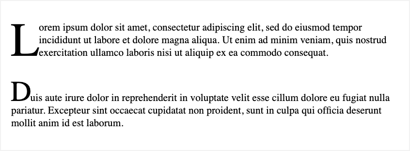
initial-letter
A drop cap (dropped capital) refers to specific styling for the first letter of a paragraph or block of text. You may see this style in books or magazines, where the initial letter is much larger, heavier, and often comes with ornate decoration or other style flourishes.
Related
How to Create a Drop Cap in Google Docs
You can subtly improve the appearance of your document with a drop cap.
This effect used to be possible, but only by using the float property with some careful tweaks to related styles. The initial-letter property simplifies this, with a simple value indicating the scale of that letter:
        p {

    initial-letter: 3;
}
You can also provide a second value which determines the baseline of the drop-capped letter:
        p {

    initial-letter: 2 1;
}
Using these values, you can control the size and vertical position of drop-capped letters:
6
text-emphasis
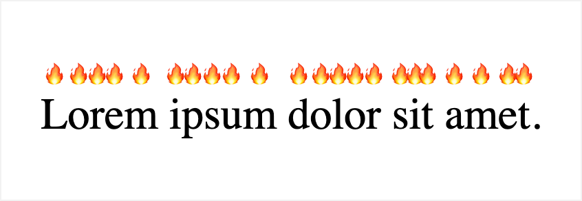
The text-emphasis property has nothing to do with the em (emphasis) tag or the italic value for font-style that can be used to mimic the look of emphasized text. Instead, it’s a way of marking text to emphasize it, a bit like underlining it. The main difference is that text-emphasis draws a specific character either above or below individual characters.
p {
text-emphasis: filled double-circle red;
}.info {
text-emphasis: "!";
}
You can use the text-emphasis-position property to display marks either over or under the text in horizontal writing mode. But it’s the text-emphasis style property that gets really interesting (text-emphasis is a shorthand for both). You can use a value like “triangle” or “circle” to use a generic symbol. You can also use any Unicode character, in quote marks, including emojis:
A “sesame” is a typographic mark used in East Asian languages for emphasis. Since text-emphasis supports this character, your CSS can now legitimately include the value “open sesame.”
7
text-wrap-style
The text-wrap-style property is the newest in this list, with support across the latest browsers landing in October 2024. When text inside an element wraps, this property hints to the browser what its priority should be.
The two most significant values are pretty and balance. The former suggests that the browser should optimize for layout over speed. It should include improvements like keeping the number of orphan elements to a minimum. Meanwhile, balance should ensure the number of characters on each line is as close as possible.
Since it’s instructive, and support is still new, you might not notice a huge difference when using this property. The best way to try it out is to experiment on existing pages and see what the various effects are like. Either way, though, it’s totally safe to use since the effect is subtle, with a reasonable default.

